Customising
The viewer is styled through CSS custom properties on the asyncapi-viewer element. Two accents
are enough; everything else, badge text colours included, is derived from them with the contrast
rules built in. The theme file that ships with the package is the starting point:
asyncapi-viewer {
  --asyncapi-primary: #2944C9;      /* send operations, links, highlights */
  --asyncapi-secondary: #B84E1A;    /* receive operations, required labels */
  /* --asyncapi-logo: url("/assets/logo.svg");        optional; use a site-absolute path */
  /* --asyncapi-logo-dark: url("/assets/logo-dark.svg"); optional */
}
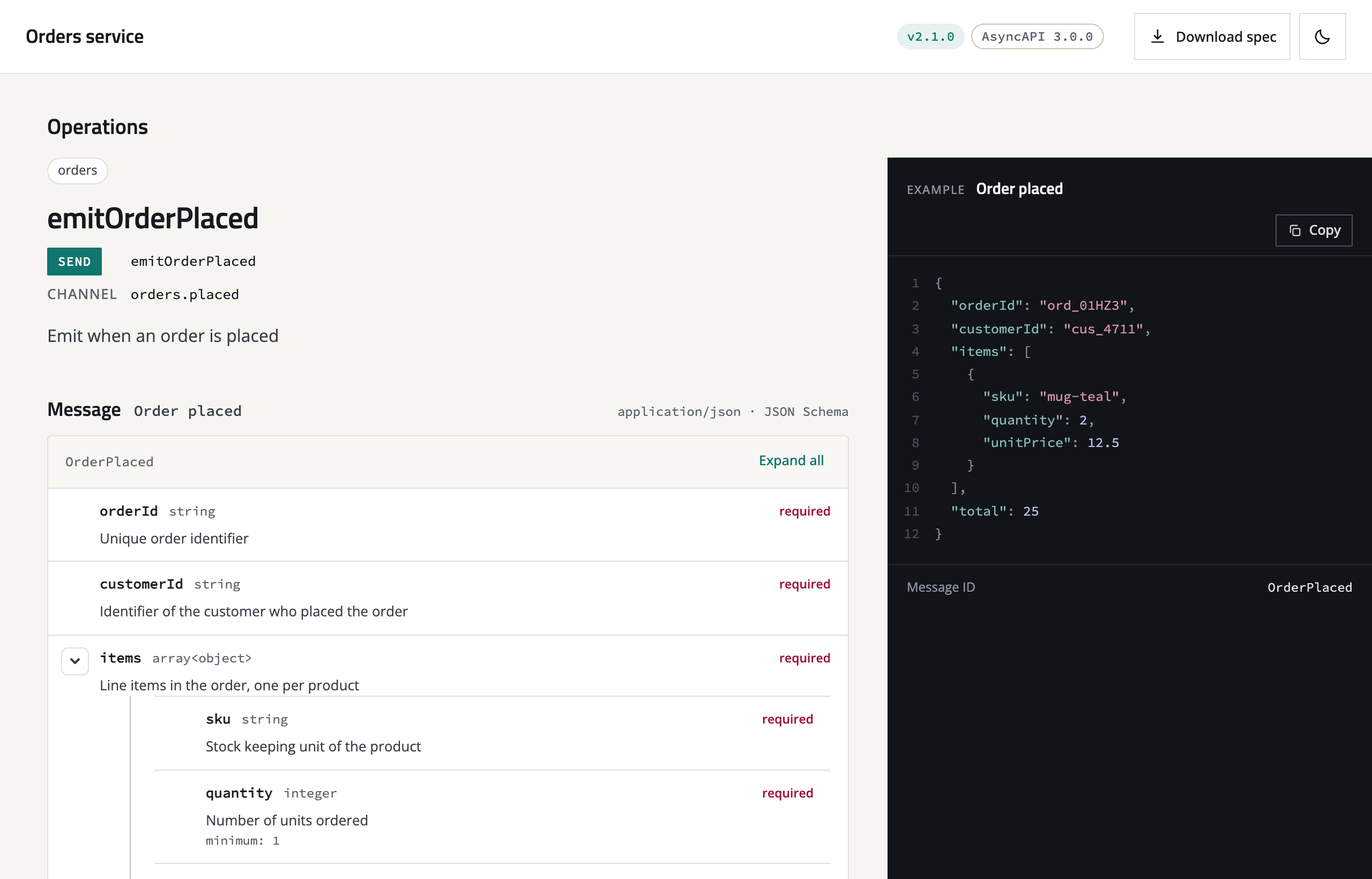
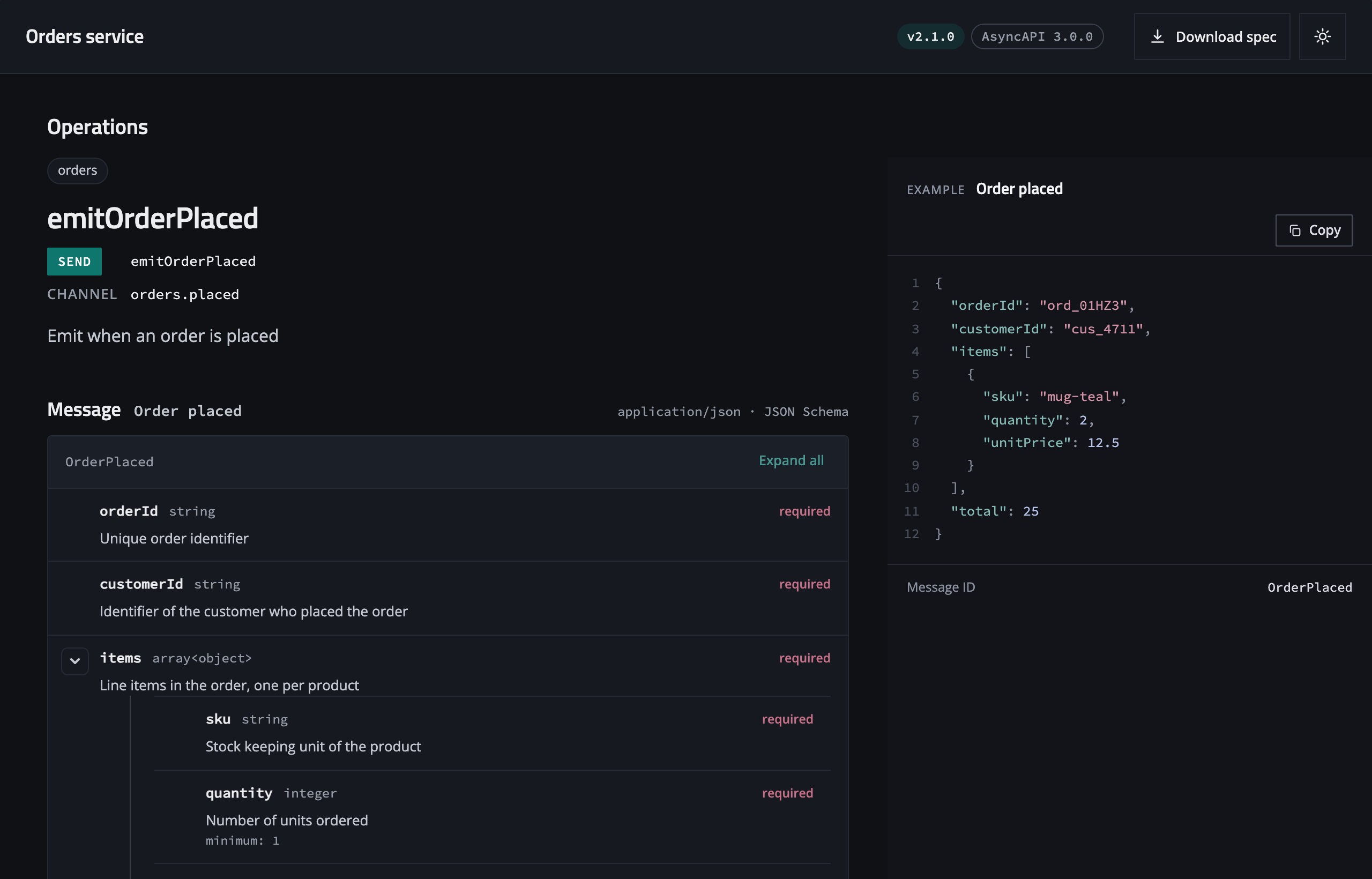
With the demo's two accents and a squarer radius, three lines of CSS (shown below):
Where to put overrides
Any stylesheet loaded after the theme file works, so under MkDocs an extra_css file is the usual
place. Scope the rules to one viewer with a class when a page has several:
asyncapi-viewer {
  --asyncapi-primary: #0F766E;
}
asyncapi-viewer.compact {
  --asyncapi-radius: 4px;
}
Or replace the theme file altogether: copy asyncapi-theme.css out of the package
(python -m asyncapi_viewer copy-assets writes it next to the scripts), edit it, and point
viewer_theme at your copy (see Configuration).
Light and dark
theme="auto" (the default) follows the page: Material for MkDocs' colour scheme, then
html[data-theme="dark"], then the system preference, watched live. theme="light" and
theme="dark" pin it, and themeToggle adds a switch to the viewer header. The resolved mode is
reflected on the element, so a value can be scoped to one mode:
asyncapi-viewer[resolved-theme="dark"] {
  --asyncapi-bg: #000;
}
Matching a Material palette
The viewer keeps its own colours by default so every site looks right without tuning. To take the site's primary colour and fonts instead, map Material's variables onto the viewer's:
asyncapi-viewer {
  --asyncapi-primary: var(--md-primary-fg-color);
  --asyncapi-font-body: var(--md-text-font-family);
  --asyncapi-font-mono: var(--md-code-font-family);
}
Fonts
The default stacks name the typefaces Swagger UI uses, Titillium Web for headings, Open Sans for
text and Source Code Pro for code, so REST and event documentation on one site read alike. Each
falls back to the system stack, because the viewer never loads web fonts itself (Content Security
Policy, privacy, offline builds). To get the design fonts, load them once in the page, for example
from Google Fonts through extra_css:
@import url("https://fonts.googleapis.com/css2?family=Open+Sans:wght@400;500;600&family=Titillium+Web:wght@600&family=Source+Code+Pro:wght@400;500&display=swap");
A self-hosted @font-face works the same, and Material's own font settings apply when you map
its variables as above.
All variables
Values shown are the defaults; dark-mode values in brackets.
| Variable | Default | Used for |
|---|---|---|
--asyncapi-primary |
#2944C9 |
Send and request badges, links, highlights, focus rings |
--asyncapi-secondary |
#B84E1A |
Receive and reply badges, required labels, the reply block accent |
--asyncapi-send, --asyncapi-receive |
the two accents | Badge colours, when they should differ from the accents |
--asyncapi-logo, --asyncapi-logo-dark |
none | A logo in the header, per mode |
--asyncapi-font-heading |
'Titillium Web', ui-sans-serif, system-ui, sans-serif |
Headings |
--asyncapi-font-body |
'Open Sans', ui-sans-serif, system-ui, sans-serif |
Text |
--asyncapi-font-mono |
'Source Code Pro', ui-monospace, SFMono-Regular, Menlo, monospace |
Code, addresses, field names |
--asyncapi-radius |
10px |
Card and panel corners |
--asyncapi-example-width |
452px |
The example panel beside a message, clamped between 360px and 560px |
--asyncapi-example-bg |
#12141A |
The example panel background, both modes |
--asyncapi-bg |
#F6F5F1 (#0F1115) |
Page background |
--asyncapi-surface |
#FFFFFF (#161920) |
Cards and the header |
--asyncapi-sidebar |
#EFEDE7 (#12151A) |
The sidebar |
--asyncapi-head |
#F8F7F3 (#1B1F27) |
Table and tree toolbars |
--asyncapi-ink |
#17191F (#ECEDEF) |
Main text |
--asyncapi-ink-2 |
#3A3E48 (#C4C8D0) |
Secondary text |
--asyncapi-muted |
#5E626D (#959BA7) |
Labels and metadata |
--asyncapi-line |
#E3E0D8 (#262A33) |
Borders |
--asyncapi-line-2 |
#C9C5BA (#3A404C) |
Tree guide lines |
Badge text colours and the text-safe versions of the accents are computed at runtime from the resolved values, so a pale accent still gives readable badges and links in both modes.